
Your service page on medical practice websites is your front desk when your team’s off the phones. If it’s hard to find the “Book” button, if the page buries insurance details, or if mobile users have to pinch and zoom, patients won’t wait around.
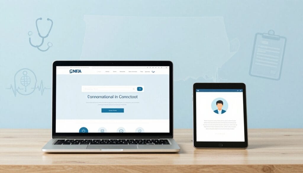
The fix isn’t more words. It’s better structure. Medical website templates give CT medical practices a repeatable layout that moves patients from “Do you treat this?” to “I’m booked” with fewer clicks, fewer questions, and fewer missed calls.
Below is a practical, template-driven layout you can implement using medical WordPress themes for primary care, urgent care, PT, dental, derm, and specialties.
What your CT service page must do in 10 seconds
People don’t land on a service page to admire it. They land there to decide. Your job is to help them answer four questions fast:
1) Is this the right place for me?
Say who you help and where you are, in plain language. “Primary Care in West Hartford, CT” beats “Comprehensive Patient-Centered Care.”
2) Can I book right now?
Give three booking paths, all visible above the fold:
- Book online with online appointment scheduling (best for speed)
- Tap to call (best for urgency)
- Verify insurance (best for confidence)
3) What will happen next?
Patients relax when the steps are clear. A short “What to expect” section lowers anxiety and reduces no-shows.
4) Can I trust you with my time and info?
Build patient trust with specific signals: provider credentials, accepted insurance, realistic availability messaging, and reviews (if you can show them accurately).
A strong page also supports discoverability. If you’re working with an SEO agency Hartford practices rely on, or comparing Hartford SEO services from an SEO company Hartford CT, this layout built on medical website templates for medical practice websites gives your team a clean foundation for search engine optimization and local search rankings. Even a searcher typing “local seo agency near me” is ultimately trying to solve the same problem: get the right patient to the right page, then get them booked without friction.
Clinic website layout: Medical service page templates you can reuse across every service
Above-the-fold template (the booking “launchpad”)
Suggested headings (pick one):
- Primary Care in (Town), CT
- (Service) Appointments in (Town)
- Same-Week (Service) Visits in (County)
Hero copy block (fill-in):
H1: (Service) in (Town), CT
Subhead: New and returning patients, clear next steps, online scheduling available.
Trust line: Most major insurance accepted, evening hours (if true), board-certified clinicians (if true).
Primary call to action button copy options:
- Book Appointment
- Book Online Now
- Check Availability
- Schedule New Patient Visit
Secondary call to action options (place beside primary):
- Tap to Call
- Verify Insurance
- Send a Question (non-urgent)
Microcopy under CTAs (reduces wrong leads):
- “Not for emergencies. Call 911.”
- “If you’re in severe pain, call us now.”
- “Prefer online? Book in under 2 minutes.”
Middle-of-page template (answers without forcing a phone call)
Block 1: Patient education content – “Who this visit is for”
Keep it scannable. Example lines: “Annual physicals, sick visits, chronic condition follow-ups.”
Block 2: “Conditions we treat”
Use patient language (symptoms and common names). Avoid a massive list. Add “If you don’t see it, call” at the end.
Block 3: “What to expect at your appointment”
Three to five steps. Include parking notes, arrival time, and what to bring.
Block 4: Doctor profiles
Photo, name, credentials, languages, and a “Book with (Provider)” mini-CTA. If you can’t offer provider-level scheduling, don’t tease it.
Bottom-of-page template (confidence checks for patient trust)
Insurance accepted (with a reality check):
List top plans, then add: “Coverage varies by plan. We’ll confirm benefits before your visit.”
Location + hours block:
Address, parking, accessibility notes (ramp, elevator), and after-hours instructions. Include a map embed if it loads fast.
Patient testimonials:
Add a few short quotes from real patients to build credibility and patient trust.
FAQ block:
Use 6 to 10 questions you already hear at the front desk. Keep answers short.
Booking forms that convert fast (without risking privacy)
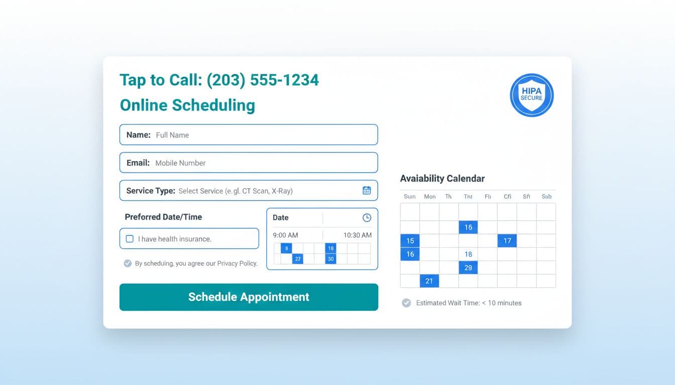
Healthcare providers know the goal is fewer steps. Each extra field is a reason to abandon. Keep the first form focused on routing and contact, not medical history (save that for the secure patient portal). This feeds into your online booking system.
Recommended HIPAA-compliant form fields (with privacy notes)
| Field | Why it’s needed | Privacy note |
|---|---|---|
| Full name | Match patient record | Don’t ask for SSN |
| Phone number | Fast scheduling follow-up | Add “Text ok?” toggle if used |
| Confirmations and reminders | Don’t include diagnosis in subject lines | |
| Visit type | Route to correct schedule | Use plain options, not codes |
| Preferred day/time | Sets expectation | Offer “Next available” option |
| New or returning | Workflow + paperwork | Keep it one tap |
| Insurance (plan name) | Eligibility check | Avoid policy numbers on this first form |
Add these safety lines near the submit button to support HIPAA compliance:
- “Do not include medical details on this form.”
- “If this is urgent, call our office.”
- Link your Notice of Privacy Practices (and keep it easy to read).
If you want a deeper look at how privacy and accessibility intersect on medical sites, see HIPAA, ADA, and WCAG guidance for medical websites.
Faster booking user experience details that are measurable
- Show availability messaging: “Next available: Tuesday” or “Typical wait: 2 to 3 days.” Don’t guess. Pull from your schedule rules if possible.
- Reduce clicks: One primary action per screen. No competing CTAs that lead to dead ends.
- Fast loading times: Aim for under 3 seconds to keep users engaged.
- Confirm instantly: After submission, show “We received your request” plus the next step and timeframe.
Mobile-first and accessibility that keeps patients moving
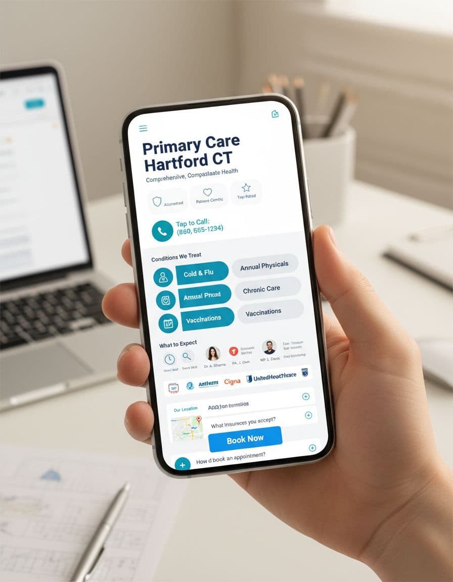
Most patients will meet your page on a phone. Mobile-friendly design isn’t a smaller desktop; responsive website design delivers a shorter path with fast loading times essential to mobile-friendly design.
Mobile booking essentials:
- Sticky CTA: “Book” button pinned to the bottom, plus a tap-to-call icon.
- Big tap targets: Buttons and form inputs that don’t cause mis-taps.
- Short sections: Break content into clear blocks with strong headings.
Accessibility checks for medical practice websites that support faster booking:
- High-contrast buttons and text (aim for readable contrast, not pale gray).
- Proper labels on every input (placeholders aren’t labels).
- Visible keyboard focus states for users who tab through the page.
- Error messages that explain how to fix the issue, not just “invalid.”
- No required “create an account” step to request an appointment.
For a practical summary of healthcare accessibility expectations for healthcare providers, review healthcare website accessibility and ADA compliance or WCAG 2.2-focused healthcare accessibility guidance.
Compliance note for healthcare providers (not legal advice): This article is general information, not legal advice. Review your forms, tracking tools, and patient data flows with qualified counsel and vendors. For official references, consult HHS for HIPAA resources, ADA guidance on accessibility, CMS for participation and patient-facing requirements, and Google Business Profile documentation for appointment links and local visibility settings.
Conversion Rate Optimization for Healthcare Marketing: How to Improve the Template Without Guessing
Make small changes, measure, then keep what works.
Track these basics:
- Clicks on Book, Call, Verify Insurance
- Form starts vs. form submits
- Mobile conversion rate vs. desktop
- Top page exits (where people give up)
Leverage website builders and their built-in online booking system analytics to track these changes easily.
Easy tests that often help:
- Put “Insurance accepted” higher on the page.
- Test call to action button text by swapping “Request Appointment” to “Check Availability.”
- Cut one form field to improve user experience, then watch submit rate.
Conclusion
A good service page isn’t a brochure, it’s a booking path. With the right medical service page templates, CT practices can guide patients to the next step faster, with less confusion and fewer calls that start with “Do you take my insurance?”
Whether using Medical WordPress themes, Webflow templates, or other Website builders, the core structure remains vital. Customizable medical templates and Medical website templates improve the patient journey by making updates easier and providing a clearer path to book. These templates also support long-term Search engine optimization and Responsive website design, ensuring your site performs well for years to come.
